Samsung One UI: Top features that make it new, beautiful and different
One UI is a new revolution in Samsung's user interface (UI) cycle and designed to bring handiness to its user. As the successor of Samsung Experience, One UI brings new intuitive UI along with new Android version - 9.0 Pie. With its new design, One UI also brings new features and improvements. So, here are some of the eye-catching things you can find in Samsung's One UI.
• One UI is available on limited mobile models. Kindly check mobile specification or Samsung Members for Software Upgrade schedule.
• Depending on model and country or network operator, supported functions may change.
With One UI, Samsung has introduced a clean and re-engineered design that is decluttered and shows relevant information that keeps you focused on the screen, powered by cleaner, flatter and rounder UI contents with dynamic animations from icons to menus. One UI has also introduced a new task manager for multitasking and to manage the recent apps, directly inherited from Android 9.0 Pie.
UI Changes


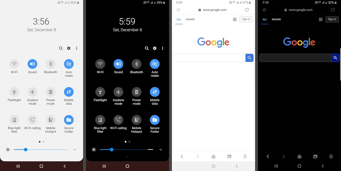
One of the best features of this new UI includes is the 'Night Mode', which offers the system-level dark theme. Samsung introduced this feature for a comfortable screen viewing experience and to reduce eye strain in the dark environment. While activated it gives a dark look to the UI, making it more focusable on the task in hand.
UI Comparison between Night and Regular Mode


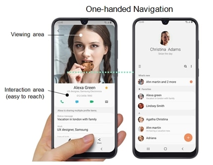
Samsung devices are famous for their unique and bigger screen sizes, that's why it may not be easier to throw your thumb across the screen while operating your device with one hand. To solve this problem, Samsung brought a huge change with One UI which helps to make user reach out on-screen content without overstretching their fingers (One Handed operation). To add more compatibility, some menus include items tabs, placed at the bottom of the display instead of the top.
Although it may seem that this a waste of space because the new menu design occupies more than 30% space from the top to show you a single word like "Settings", "Messages" and others but to make it work, it simply pushes the interactive content below the occupied space to allow users to easily catch the first menu option and as user scroll to the bottom its automatically collapses to a regular status bar.
One Handed Navigation


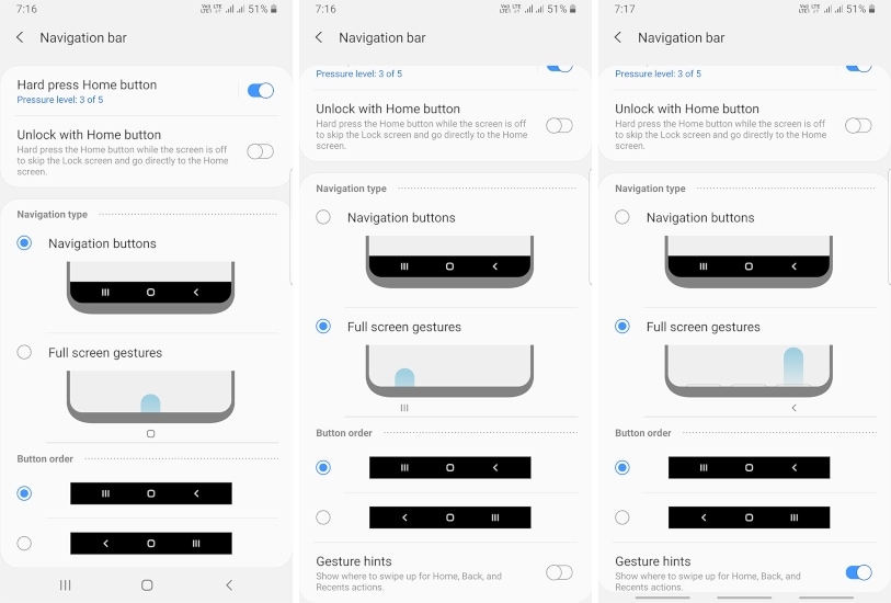
Samsung's navigation bar contains three buttons including 'Back', 'Home' and 'Recent' actions that can be reorganized in order and now with Android Pie update, users can also use "Navigation Gestures" which replaces on-screen navigation buttons, providing a full-screen view for a better viewing experience.
Navigation Bar Types

One UI users can awake their device by simply lifting their device up from its idle position. This new feature works on sensors which are based on the accelerometer or gyroscope and when a user lift their phone and tilt it upwards from the top in the Z-axis it automatically triggers the phone to awake the lock screen.
Thank you for your feedback!
Please answer all questions.


